News & Blog
Beware Of Website Designs With Too Many Fonts
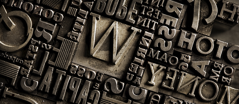
Beware of website designs with too many different fonts. Have you seen website designs of late that use a myriad of different fonts? I have and it makes me wince, partly because I’ve seen this before. Back in the early desktop publishing days, the trend was to use as many different fonts as possible, simple because they were available. I recall sales people reviewing designs and telling me “there are not enough fonts.” Fortunately this trend died out years ago.
However, now that the web can use a myriad of fonts, designers are doing exactly that. It’s a bad idea. This does nothing but confuse the eye.
A well designed site should only use up to two type families, *maybe* three at the most if the designer is really good at what they do. Using a limited palette of fonts keeps the design cohesive and is just plain easier on the eyes.
Is your site suffering from font overload? A refresh might be in order, and that’s what we do. Feel free to call or email us.